Do you design pages in Thrive Architect from scratch?
Then I bet you hate this moment.
I’m talking about the moment when you finally finish designing, and when you test it in mobile everything looks messy. A major thing that bothers people when they test in mobile is that everything touches edge-to-edge of the screen. It looks soo ugly and broken.
I realised a small tip could save you lot of time mobile optimizing.
How do we prevent this?
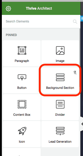
- Never have any element that is not inside a background section (ref screenshot below). Its simply good practice to have a parent container for your content. Beware of not putting everything in a single background section. Especially for long form sales pages (if you make any of those).I recommend a background section to be maximum of 1-2 screen scrolls in height. If that was confusing, let me try rephrasing that – If your page is long, make sure each background section within isn’t too tall/long. What I mean by too tall/long is a background section cannot be more than 2 times your screen height.
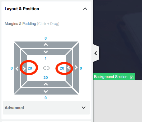
- Every background section must have 15 to 30 px padding on left and right side (ref screenshot below). This has to be set in the beginning, while on normal desktop mode. Keep the padding amount same on both sides obviously. Now this will apply to mobile mode automatically and most elements on the page will look good by default as they won’t touch edge-to-edge on mobile screens.
Hope this helped you Thrive Architect users out there. Let me know if you liked tips like this and if this helped. I have picked lot of time saving mini lessons like this over the last 3 years and would be glad to share if you’re interested.